前端三剑客-CSS
css,专门用来“美化”标签。
- 基础CSS,写简单页面 & 看懂 & 改。
- 模块,调整和修改。
3.1 快速了解
<img src="..." style="height:100px" />

<div style="color:red;">中国联通</div>
3.2 CSS应用方式
1. 在标签上
<img src="..." style="height:100px" />

<div style="color:red;">中国联通</div>
2. 在head标签中写style标签(*)
<!DOCTYPE html>
<html lang="en">
<head>
    <meta charset="UTF-8">
    <title>Title</title>
    <style>
        .c1{
            color:red;
        }
    </style>
</head>
<body>

<h1 class='c1'>用户登录</h1>
<h1 class='c1'>用户登录</h1>
<h1 class='c1'>用户登录</h1>
<h1 class='c1'>用户登录</h1>

</body>
</html>
3.写到文件中(*)
.c1{
    height:100px;
}

.c2{
    color:red;
}<!DOCTYPE html>
<html lang="en">
<head>
<meta charset="UTF-8">
<title>Title</title>
<link rel="stylesheet" href="common.css" />
</head>
<body>
<h1 class='c1'>用户登录</h1>
<h1 class='c2'>用户登录</h1>
<h1 class='c2'>用户登录</h1>
<h1 class='c1'>用户登录</h1>
</body>
</html>案例:flask中的应用(登录注册)
见示例:day11_account-1.zip
问题:用Flask框架开发不方便
- 每次都需要重启
- 规定有些文件必须要放在特定的文件夹
- 新创建一个页面
- 函数
- HTML文件
有没有一种方式,可以让我快速的编写前端的代码并查看效果呢,最后再讲页面集成到Flask中。
Pycharm为我们提供了一种非常便捷开发前端页面的工具。
3.3 选择器
ID选择器
#c1{

}

<div id='c1'></div>
类选择器(最多)
.c1{

}

<div clss='c1'></div>
标签选择器
div{

}

<div>xxx</div>
属性选择器
input[type='text']{ border: 1px solid red; } .v1[xx="456"]{ color: gold; }<input type="text"> <input type="password"> <div class="v1" xx="123">s</div> <div class="v1" xx="456">f</div> <div class="v1" xx="999">a</div>后代选择器
.yy li{ color: pink; } .yy > a{ color: dodgerblue; }<div class="yy"> <a>百度</a> <div> <a>谷歌</a> </div> <ul> <li>美国</li> <li>日本</li> <li>韩国</li> </ul> </div>
关于选择器:
多:类选择器、标签选择器、后代选择器
少:属性选择器、ID选择器
关于多个样式 & 覆盖的问题:
<!DOCTYPE html>
<html lang="en">
<head>
    <meta charset="UTF-8">
    <title>Title</title>
    <style>
        .c1{
            color: red;
            border: 1px solid red;
        }
        .c2{
            font-size: 28px;
            color: green;
        }
    </style>
</head>
<body>
    <div class="c1 c2">中国联通</div>
</body>
</html>
补充:下面的不要覆盖我。
<!DOCTYPE html>
<html lang="en">
<head>
    <meta charset="UTF-8">
    <title>Title</title>
    <style>
        .c1{
            color: red !important;
            border: 1px solid red;
        }
        .c2{
            font-size: 28px;
            color: green;
        }
    </style>
</head>
<body>
    <div class="c1 c2">中国联通</div>
</body>
</html>
3.4 样式
1. 高度和宽度
.c1{
    height: 300px;
    width: 500px;
}
注意事项:
- 宽度,支持百分比。
- 行内标签:默认无效
- 块级标签:默认有效(霸道,右侧区域空白,也不给你占用)
2. 块级和行内标签
- 块级
- 行内
- css样式:标签 ->
display:inline-block
示例:行内&块级特性
<!DOCTYPE html>
<html lang="en">
<head>
    <meta charset="UTF-8">
    <title>Title</title>
    <style>
        .c1{
            display: inline-block;

            height: 100px;
            width: 300px;
            border: 1px solid red;
        }
    </style>
</head>
<body>
    <span class="c1">中国</span>

    <span class="c1">联通</span>

    <span class="c1">联通</span>

    <span class="c1">联通</span>
</body>
</html>
示例:块级和行内标签的设置
<!DOCTYPE html>
<html lang="en">
<head>
    <meta charset="UTF-8">
    <title>Title</title>
    <style>

    </style>
</head>
<body>
    <div style="display: inline;">中国</div>
    <span style="display: block;">联通</span>
</body>
</html>
注意:块级 + 块级&行内。
3.字体设置
- 颜色
- 大小
- 加粗
- 字体格式
<!DOCTYPE html>
<html lang="en">
<head>
    <meta charset="UTF-8">
    <title>Title</title>
    <style>
        .c1{
            color: #00FF7F;
            font-size: 58px;
            font-weight: 600;
            font-family: Microsoft Yahei;
        }
    </style>
</head>
<body>
    <div class="c1">中国联通</div>
    <div>中国移动</div>
</body>
</html>
4.文字对齐方式
<!DOCTYPE html>
<html lang="en">
<head>
    <meta charset="UTF-8">
    <title>Title</title>
    <style>
        .c1{
            height: 59px;
            width: 300px;
            border: 1px solid red;

            text-align: center; /* 水平方向居中 */
            line-height: 59px; /* 垂直方向居中 */
        }
    </style>
</head>
<body>
    <div class="c1">郭智</div>
</body>
</html>
5.浮动
<!DOCTYPE html>
<html lang="en">
<head>
    <meta charset="UTF-8">
    <title>Title</title>
</head>
<body>
    <div>
        <span>左边</span>
        <span style="float: right">右边</span>
    </div>
</body>
</html>
div默认块级标签(霸道),如果浮动起来,就不一样了。
<!DOCTYPE html>
<html lang="en">
<head>
    <meta charset="UTF-8">
    <title>Title</title>
    <style>
        .item{
            float: left;
            width: 280px;
            height: 170px;
            border: 1px solid red;
        }
    </style>
</head>
<body>
    <div>
        <div class="item"></div>
        <div class="item"></div>
        <div class="item"></div>
        <div class="item"></div>
        <div class="item"></div>
    </div>
</body>
</html>
如果你让标签浮动起来之后,就会脱离文档流。
<!DOCTYPE html>
<html lang="en">
<head>
    <meta charset="UTF-8">
    <title>Title</title>
    <style>
        .item {
            float: left;
            width: 280px;
            height: 170px;
            border: 1px solid red;
        }
    </style>
</head>
<body>
    <div style="background-color: dodgerblue">
        <div class="item"></div>
        <div class="item"></div>
        <div class="item"></div>
        <div class="item"></div>
        <div class="item"></div>
        <div style="clear: both;"></div>
    </div>
    <div>你哦啊呀</div>
</body>
</html>
6.内边距
内边距,我自己的内部设置一点距离。
<!DOCTYPE html>
<html lang="en">
<head>
    <meta charset="UTF-8">
    <title>Title</title>
    <style>
        .outer{
            border: 1px solid red;
            height: 200px;
            width: 200px;

            padding-top: 20px;
            padding-left: 20px;
            padding-right: 20px;
            padding-bottom: 20px;
        }
    </style>
</head>
<body>
    <div class="outer">
        <div style="background-color: gold;">听妈妈的话</div>
        <div>
            小朋友你是否下水道发
        </div>
    </div>
</body>
</html><!DOCTYPE html>
<html lang="en">
<head>
<meta charset="UTF-8">
<title>Title</title>
<style>
.outer{
border: 1px solid red;
height: 200px;
width: 200px;
padding: 20px;
}
</style>
</head>
<body>
<div class="outer">
<div style="background-color: gold;">听妈妈的话</div>
<div>
小朋友你是否下水道发
</div>
</div>
</body>
</html><!DOCTYPE html>
<html lang="en">
<head>
<meta charset="UTF-8">
<title>Title</title>
<style>
.outer{
border: 1px solid red;
height: 200px;
width: 200px;
padding: 20px 10px 5px 20px;
}
</style>
</head>
<body>
<div class="outer">
<div style="background-color: gold;">听妈妈的话</div>
<div>
小朋友你是否下水道发
</div>
</div>
</body>
</html>7.外边距
外边距,我与别人加点距离。
<!DOCTYPE html>
<html lang="en">
<head>
<meta charset="UTF-8">
<title>Title</title>
</head>
<body>
<div style="height: 200px;background-color: dodgerblue;"></div>
<div style="background-color: red;height: 100px;margin-top: 20px;"></div>
</body>
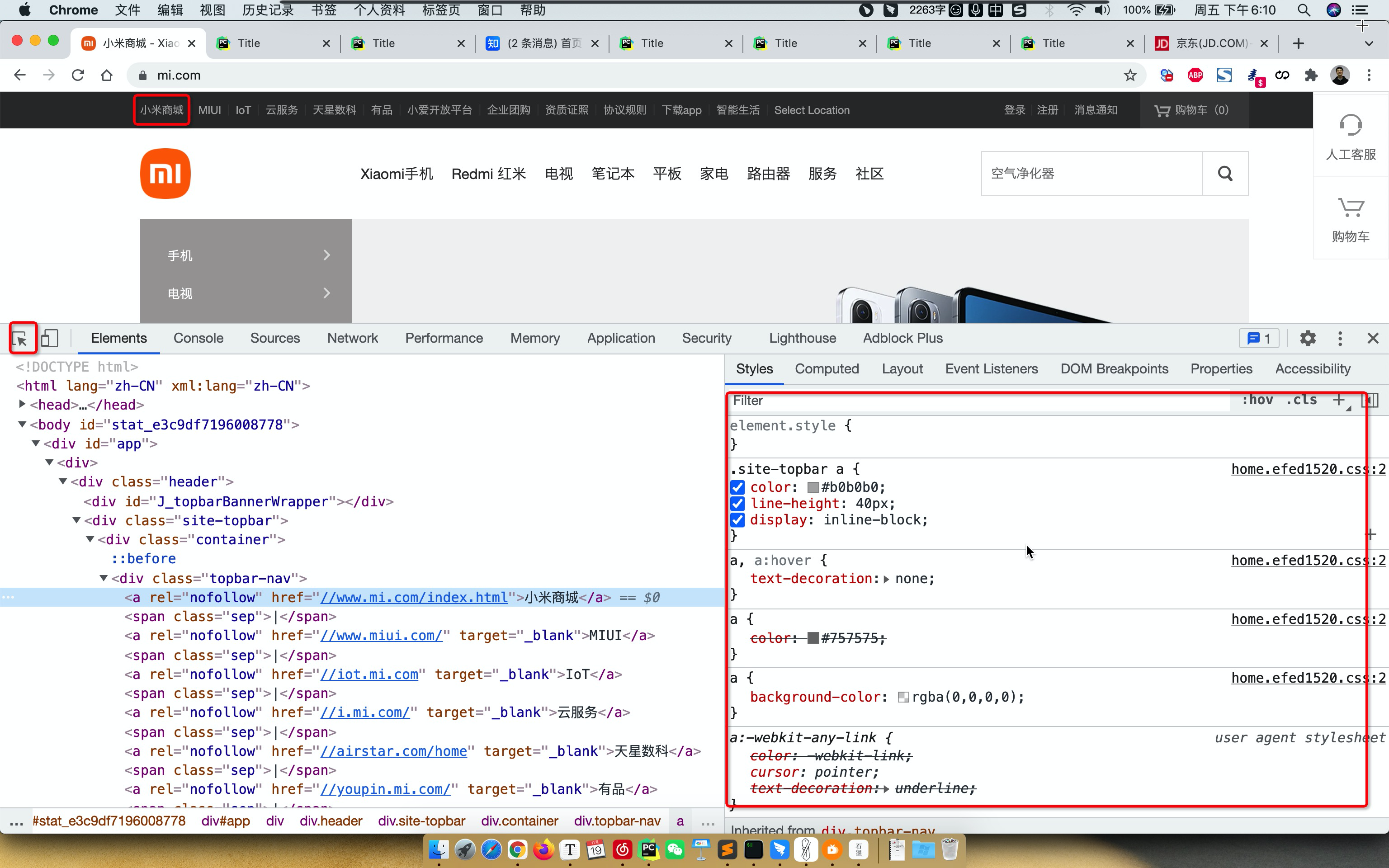
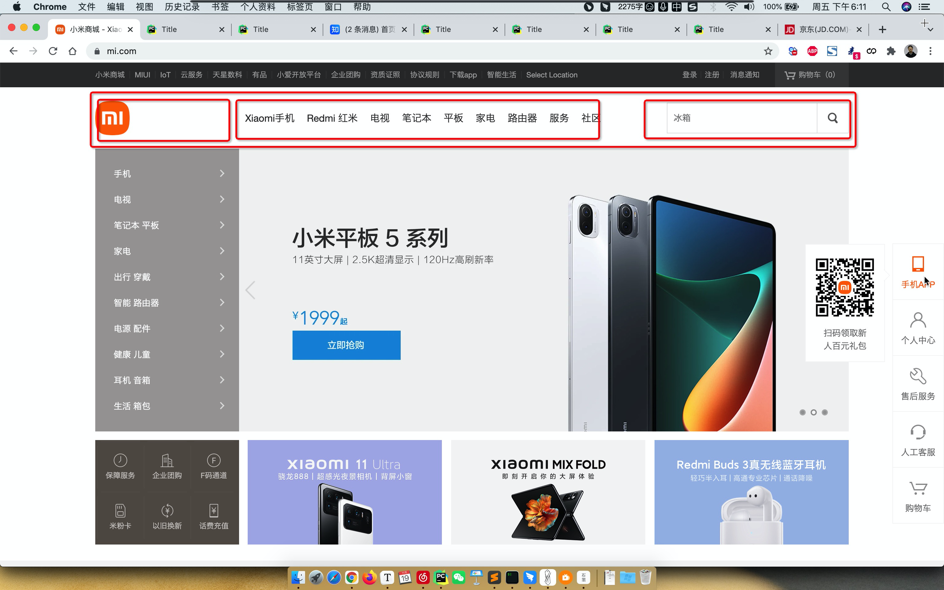
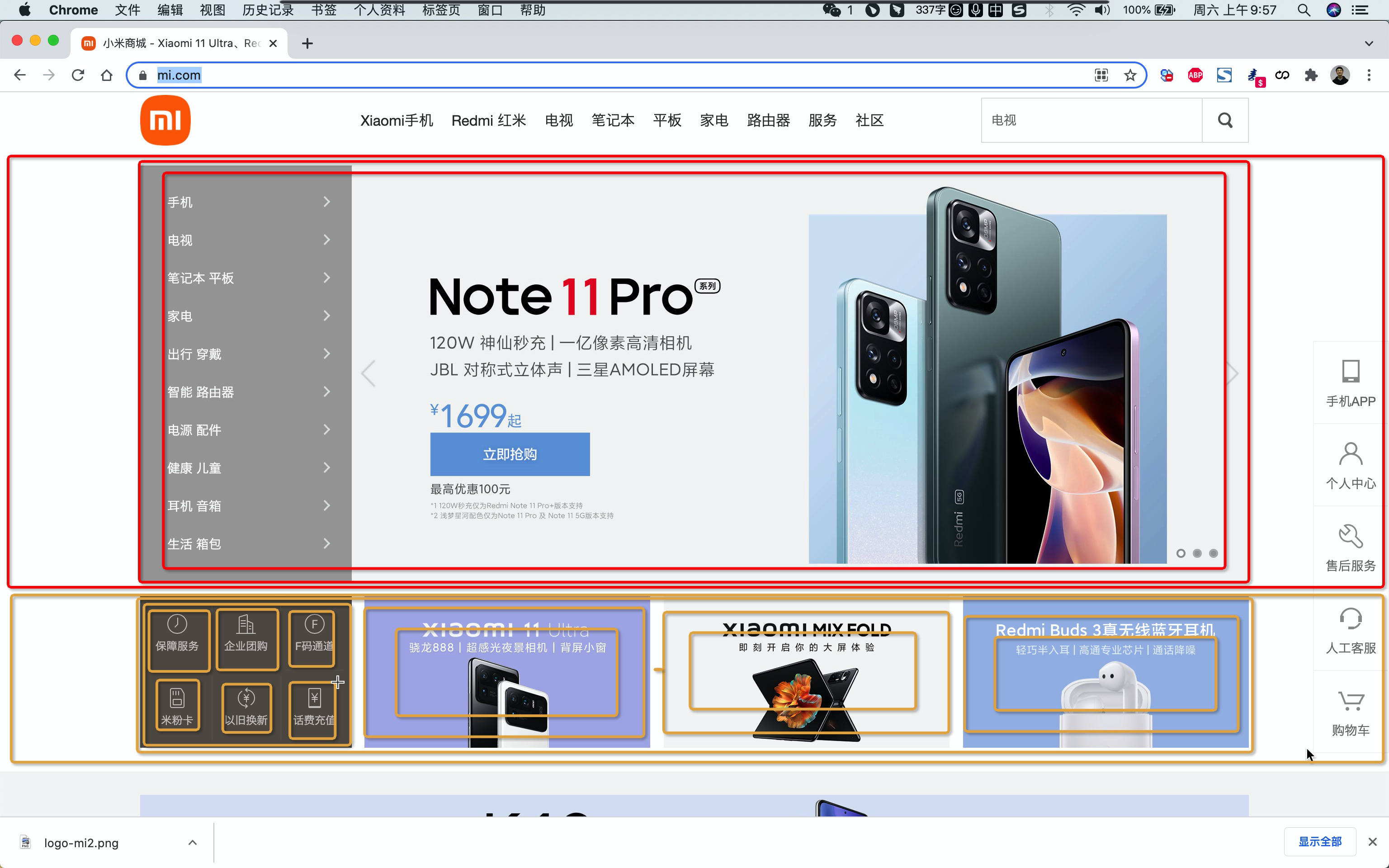
</html>案例:小米商场
<!DOCTYPE html>
<html lang="en">
<head>
<meta charset="UTF-8">
<title>Title</title>
<style>
body {
margin: 0;
}
.header {
background: #333;
}
.container {
width: 1226px;
margin: 0 auto;
}
.header .menu {
float: left;
color: white;
}
.header .account {
float: right;
color: white;
}
.header a {
color: #b0b0b0;
line-height: 40px;
display: inline-block;
font-size: 12px;
margin-right: 10px;
}
</style>
</head>
<body>
<div class="header">
<div class="container">
<div class="menu">
<a>小米商城</a>
<a>MIUI</a>
<a>云服务</a>
<a>有品</a>
<a>开放平台</a>
</div>
<div class="account">
<a>登录</a>
<a>注册</a>
<a>消息通知</a>
</div>
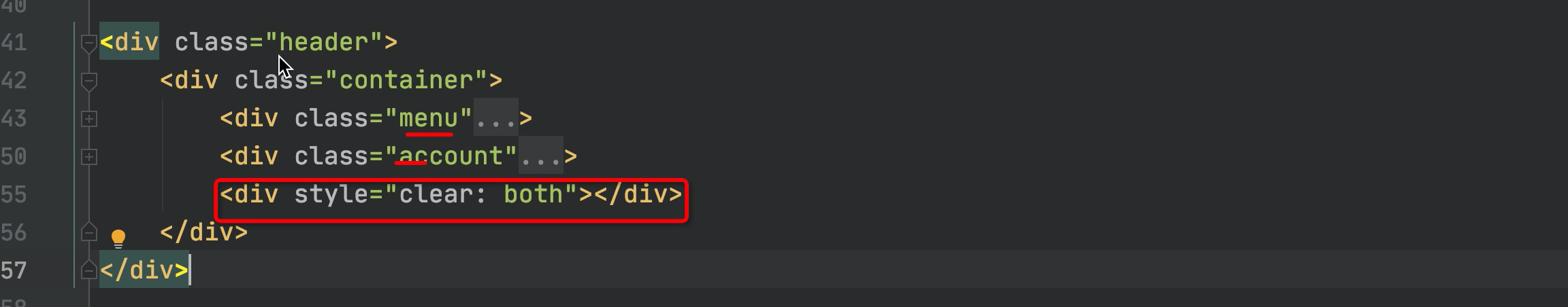
<div style="clear: both"></div>
</div>
</div>
</body>
</html>总结
body标签,默认有一个边距,造成页面四边都有白色间隙,如何去除呢?
body{
	margin: 0;
}
内容居中
文本居中,文本会在这个区域中居中。
<div style="width: 200px; text-align: center;">武沛齐</div>区域居中,自己要有宽度 +
margin-left:auto;margin-right:auto.container{ width: 980px; margin: 0 auto; } <div class="container"> adfasdf </div>
父亲没有高度或没有宽度,被孩子支撑起来。
如果存在浮动,一定记得加入 。
如果想要用别人的样式。
关于布局不知如何下手。
1.CSS案例
1.1 内容回顾
HTML标签
固定格式,记住标签长什么样子,例如:
h/div/span/a/img/ul/li/table/input/form
CSS样式
引用CSS:标签、头部、文件
.xx{
	...
}

<div class='xx xx'></div>
CSS样式
高度/宽度/块级or行内or块级行内/浮动/字体/文字对齐方式/内边距/外边距
关于边距:
	- body
	- 区域居中
页面布局
根据你看到的页面把他们划分成很多的小区域,再去填充样式。
1.2 案例:二级菜单
1.2.1 划分区域
1.2.2 搭建骨架
<!DOCTYPE html>
<html lang="en">
<head>
    <meta charset="UTF-8">
    <title>Title</title>
    <style>
        body{
            margin: 0;
        }
        .sub-header{
            height: 100px;
            background-color: #b0b0b0;
        }
        .container{
            width: 1128px;
            margin: 0 auto;
        }
        .sub-header .ht{
            height: 100px;
        }
        .sub-header .logo{
            width: 234px;
            float: left;
        }
        .sub-header .menu-list{
            float: left;
        }

        .sub-header .search{
            float: right;
        }
    </style>
</head>
<body>
<div class="sub-header">
    <div class="container">
        <div class="ht logo">1</div>
        <div class="ht menu-list">2</div>
        <div class="ht search">3</div>
        <div class="clear:both;"></div>
    </div>
</div>

</body>
</html>
1.2.3 Logo区域
<!DOCTYPE html>
<html lang="en">
<head>
    <meta charset="UTF-8">
    <title>Title</title>
    <style>
        body {
            margin: 0;
        }

        .sub-header {
            height: 100px;
            background-color: #b0b0b0;
        }

        .container {
            width: 1128px;
            margin: 0 auto;
        }

        .sub-header .ht {
            height: 100px;
        }

        .sub-header .logo {
            width: 234px;
            float: left;
            border: 1px solid red;
        }

        .sub-header .logo a {
            margin-top: 22px;
            display: inline-block
        }

        .sub-header .logo a img {
            height: 56px;
            width: 56px;
        }

        .sub-header .menu-list {
            float: left;
        }

        .sub-header .search {
            float: right;
        }
    </style>
</head>
<body>
<div class="sub-header">
    <div class="container">
        <div class="ht logo">
            <!-- a,行内标签;默认设置高度、边距无效。 -> 块级 & 行内+块级 -->
            <a href="https://www.mi.com/">
                <img src="images/logo-mi2.png" alt="">
            </a>

        </div>
        <div class="ht menu-list">2</div>
        <div class="ht search">3</div>
        <div class="clear:both;"></div>
    </div>
</div>

</body>
</html>
1.2.4 菜单部分
<!DOCTYPE html>
<html lang="en">
<head>
<meta charset="UTF-8">
<title>Title</title>
<style>
body {
margin: 0;
}
.sub-header {
height: 100px;
}
.container {
width: 1128px;
margin: 0 auto;
}
.sub-header .ht {
height: 100px;
}
.sub-header .logo {
width: 234px;
float: left;
}
.sub-header .logo a {
margin-top: 22px;
display: inline-block
}
.sub-header .logo a img {
height: 56px;
width: 56px;
}
.sub-header .menu-list {
float: left;
line-height: 100px;
}
.sub-header .menu-list a{
display: inline-block;
padding: 0 10px;
color: #333;
font-size: 16px;
text-decoration: none;
}
.sub-header .menu-list a:hover{
color: #ff6700;
}
.sub-header .search {
float: right;
}
</style>
</head>
<body>
<div class="sub-header">
<div class="container">
<div class="ht logo">
<!-- a,行内标签;默认设置高度、边距无效。 -> 块级 & 行内+块级 -->
<a href="https://www.mi.com/">
<img src="images/logo-mi2.png" alt="">
</a>
</div>
<div class="ht menu-list">
<a href="https://www.mi.com/">Xiaomi手机</a>
<a href="https://www.mi.com/">Redmi红米</a>
<a href="https://www.mi.com/">电视</a>
<a href="https://www.mi.com/">笔记本</a>
<a href="https://www.mi.com/">平板</a>
</div>
<div class="ht search"></div>
<div class="clear:both;"></div>
</div>
</div>
</body>
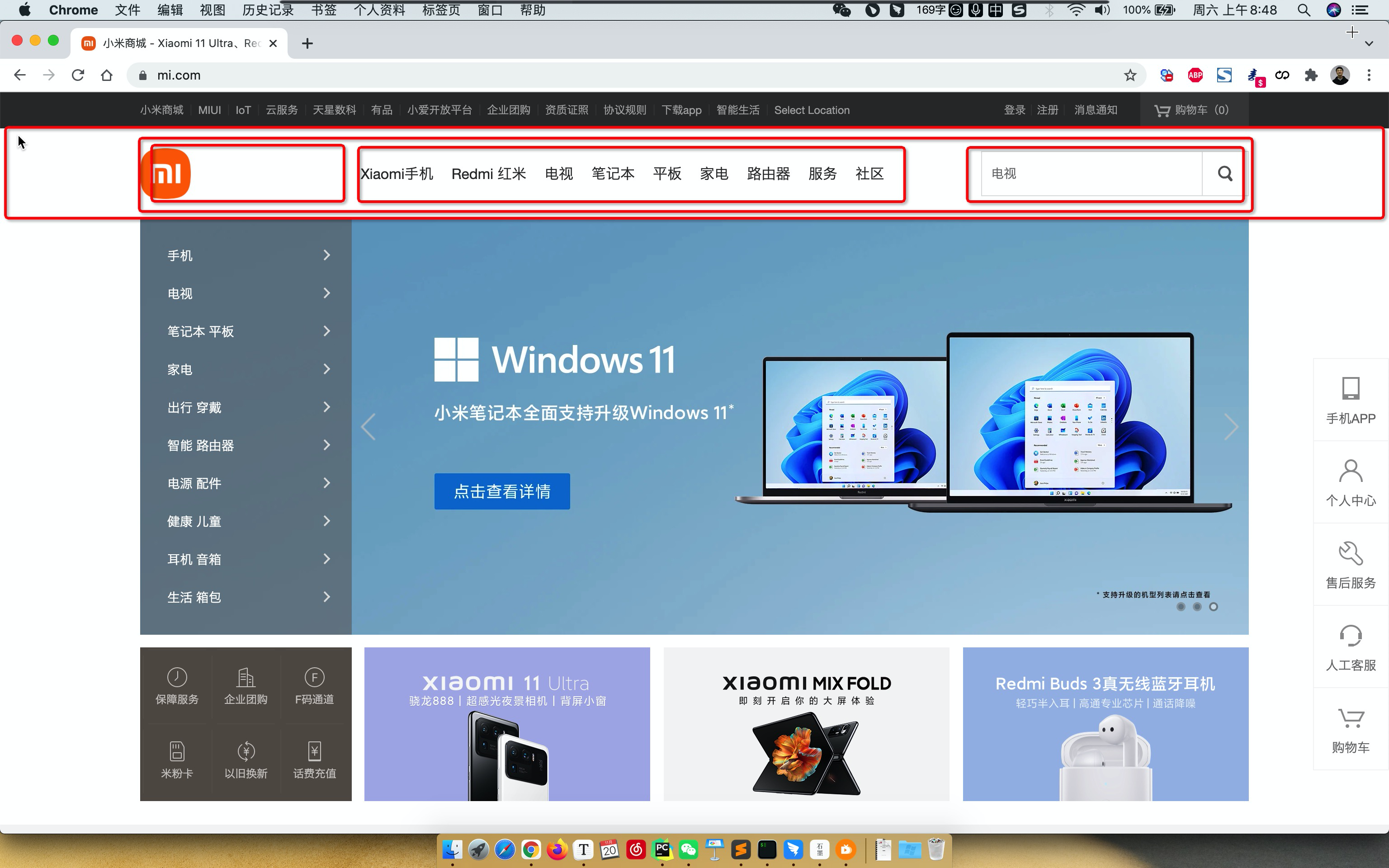
</html>1.3 案例:顶部菜单 + 二级菜单
<!DOCTYPE html>
<html lang="en">
<head>
    <meta charset="UTF-8">
    <title>Title</title>
    <style>
        body {
            margin: 0;
        }

        .container {
            width: 1226px;
            margin: 0 auto;
        }


        .header {
            background: #333;
        }


        .header .menu {
            float: left;
            color: white;
        }

        .header .account {
            float: right;
            color: white;
        }

        .header a {
            color: #b0b0b0;
            line-height: 40px;
            display: inline-block;
            font-size: 12px;
            margin-right: 10px;

            text-decoration: none;
        }
        .header a:hover{
            color: white;
        }

        .sub-header {
            height: 100px;
        }

        .sub-header .ht {
            height: 100px;
        }

        .sub-header .logo {
            width: 234px;
            float: left;

        }

        .sub-header .logo a {
            margin-top: 22px;
            display: inline-block
        }

        .sub-header .logo a img {
            height: 56px;
            width: 56px;
        }

        .sub-header .menu-list {
            float: left;

            line-height: 100px;
        }

        .sub-header .menu-list a {
            display: inline-block;
            padding: 0 10px;
            color: #333;
            font-size: 16px;
            text-decoration: none;
        }

        .sub-header .menu-list a:hover {
            color: #ff6700;
        }

        .sub-header .search {
            float: right;
        }
    </style>
</head>
<body>

<div class="header">
    <div class="container">
        <div class="menu">
            <a href="https://www.mi.com/">小米商城</a>
            <a href="https://www.mi.com/">MIUI</a>
            <a href="https://www.mi.com/">云服务</a>
            <a href="https://www.mi.com/">有品</a>
            <a href="https://www.mi.com/">开放平台</a>
        </div>
        <div class="account">
            <a href="https://www.mi.com/">登录</a>
            <a href="https://www.mi.com/">注册</a>
            <a href="https://www.mi.com/">消息通知</a>
        </div>
        <div style="clear: both"></div>
    </div>
</div>

<div class="sub-header">
    <div class="container">
        <div class="ht logo">
            <!-- a,行内标签;默认设置高度、边距无效。 -> 块级 & 行内+块级 -->
            <a href="https://www.mi.com/">
                <img src="images/logo-mi2.png" alt="">
            </a>

        </div>
        <div class="ht menu-list">
            <a href="https://www.mi.com/">Xiaomi手机</a>
            <a href="https://www.mi.com/">Redmi红米</a>
            <a href="https://www.mi.com/">电视</a>
            <a href="https://www.mi.com/">笔记本</a>
            <a href="https://www.mi.com/">平板</a>
        </div>
        <div class="ht search"></div>
        <div class="clear:both;"></div>
    </div>
</div>


</body>
</html>
小结
a标签是行内标签,行内标签的高度、内外边距,默认无效。
垂直方向居中
- 本文 + line-height
- 图片 + 边距
a标签默认有下划线。
鼠标放上去之后hover
.c1:hover{
    ...
}
a:hover{

}
1.4 案例:推荐区域
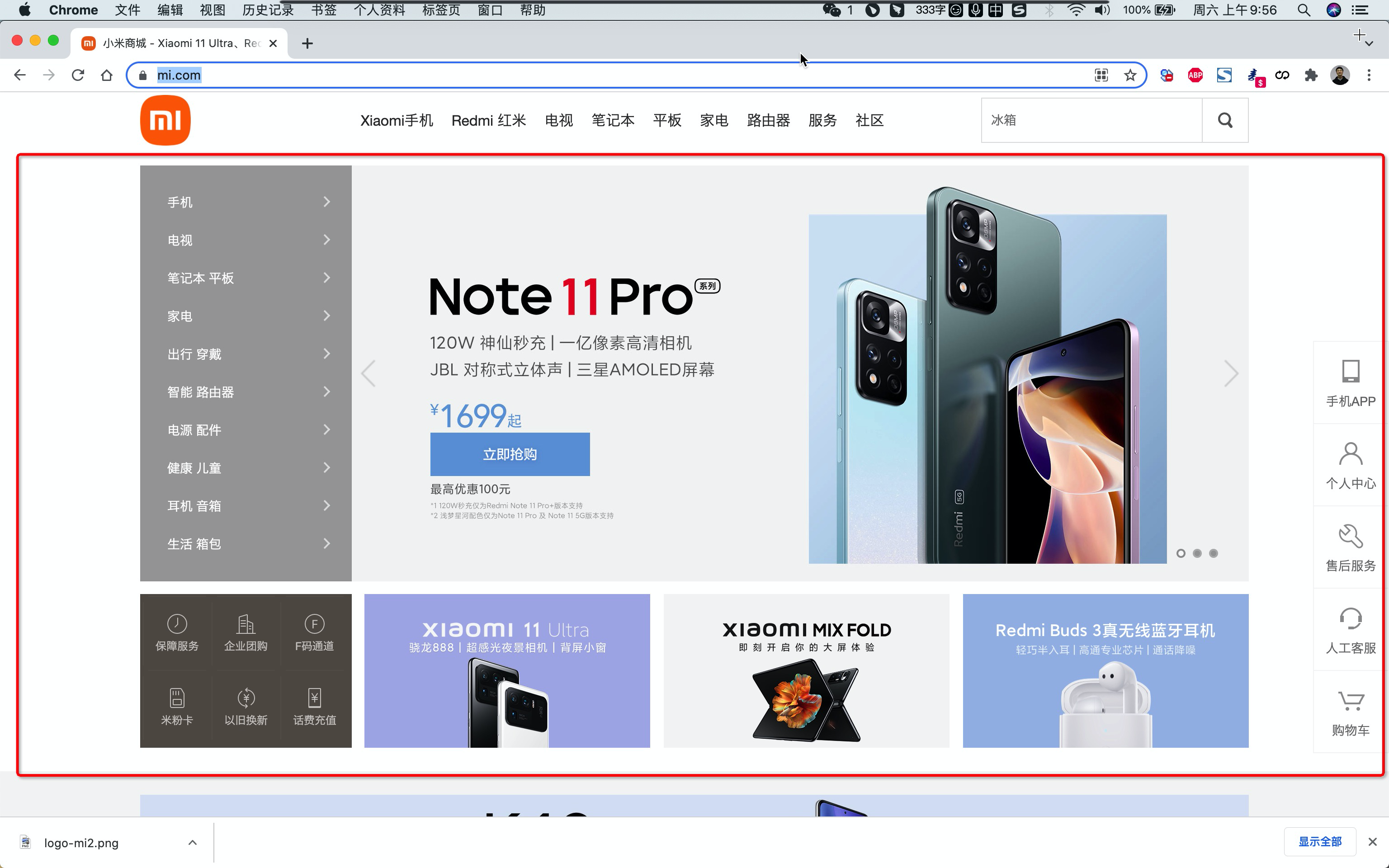
1.4.1 划分区域
1.4.2 搭建骨架
<!DOCTYPE html>
<html lang="en">
<head>
    <meta charset="UTF-8">
    <title>Title</title>
    <style>
        body {
            margin: 0;
        }

        img {
            width: 100%;
            height: 100%;
        }

        .container {
            width: 1226px;
            margin: 0 auto;
        }


        .header {
            background: #333;
        }


        .header .menu {
            float: left;
            color: white;
        }

        .header .account {
            float: right;
            color: white;
        }

        .header a {
            color: #b0b0b0;
            line-height: 40px;
            display: inline-block;
            font-size: 12px;
            margin-right: 10px;

            text-decoration: none;
        }

        .header a:hover {
            color: white;
        }

        .sub-header {
            height: 100px;
        }

        .sub-header .ht {
            height: 100px;
        }

        .sub-header .logo {
            width: 234px;
            float: left;

        }

        .sub-header .logo a {
            margin-top: 22px;
            display: inline-block
        }

        .sub-header .logo a img {
            height: 56px;
            width: 56px;
        }

        .sub-header .menu-list {
            float: left;

            line-height: 100px;
        }

        .sub-header .menu-list a {
            display: inline-block;
            padding: 0 10px;
            color: #333;
            font-size: 16px;
            text-decoration: none;
        }

        .sub-header .menu-list a:hover {
            color: #ff6700;
        }

        .sub-header .search {
            float: right;
        }

        .slider .sd-img {
            width: 1226px;
            height: 460px;
        }

    </style>
</head>
<body>

<div class="header">
    <div class="container">
        <div class="menu">
            <a href="https://www.mi.com/">小米商城</a>
            <a href="https://www.mi.com/">MIUI</a>
            <a href="https://www.mi.com/">云服务</a>
            <a href="https://www.mi.com/">有品</a>
            <a href="https://www.mi.com/">开放平台</a>
        </div>
        <div class="account">
            <a href="https://www.mi.com/">登录</a>
            <a href="https://www.mi.com/">注册</a>
            <a href="https://www.mi.com/">消息通知</a>
        </div>
        <div style="clear: both"></div>
    </div>
</div>

<div class="sub-header">
    <div class="container">
        <div class="ht logo">
            <!-- a,行内标签;默认设置高度、边距无效。 -> 块级 & 行内+块级 -->
            <a href="https://www.mi.com/">
                <img src="images/logo-mi2.png" alt="">
            </a>

        </div>
        <div class="ht menu-list">
            <a href="https://www.mi.com/">Xiaomi手机</a>
            <a href="https://www.mi.com/">Redmi红米</a>
            <a href="https://www.mi.com/">电视</a>
            <a href="https://www.mi.com/">笔记本</a>
            <a href="https://www.mi.com/">平板</a>
        </div>
        <div class="ht search"></div>
        <div class="clear:both;"></div>
    </div>
</div>

<div class="slider">
    <div class="container">
        <div class="sd-img">
            <img src="images/b1.jpeg" alt="">
        </div>
    </div>
</div>


<div class="news">
    <div class="container">
        <div class="channel"></div>
        <div class="list-item"></div>
        <div class="list-item"></div>
        <div class="list-item"></div>
    </div>
</div>


</body>
</html>
1.4.3 案例的实现
<!DOCTYPE html>
<html lang="en">
<head>
    <meta charset="UTF-8">
    <title>Title</title>
    <style>
        body {
            margin: 0;
        }

        img {
            width: 100%;
            height: 100%;
        }

        .left {
            float: left;
        }

        .container {
            width: 1226px;
            margin: 0 auto;
        }


        .header {
            background: #333;
        }


        .header .menu {
            float: left;
            color: white;
        }

        .header .account {
            float: right;
            color: white;
        }

        .header a {
            color: #b0b0b0;
            line-height: 40px;
            display: inline-block;
            font-size: 12px;
            margin-right: 10px;

            text-decoration: none;
        }

        .header a:hover {
            color: white;
        }

        .sub-header {
            height: 100px;
        }

        .sub-header .ht {
            height: 100px;
        }

        .sub-header .logo {
            width: 234px;
            float: left;

        }

        .sub-header .logo a {
            margin-top: 22px;
            display: inline-block
        }

        .sub-header .logo a img {
            height: 56px;
            width: 56px;
        }

        .sub-header .menu-list {
            float: left;

            line-height: 100px;
        }

        .sub-header .menu-list a {
            display: inline-block;
            padding: 0 10px;
            color: #333;
            font-size: 16px;
            text-decoration: none;
        }

        .sub-header .menu-list a:hover {
            color: #ff6700;
        }

        .sub-header .search {
            float: right;
        }

        .slider .sd-img {
            width: 1226px;
            height: 460px;
        }

        .news{
            margin-top: 14px;
        }

        .news .channel {
            width: 228px;
            height: 164px;
            background-color: #5f5750;
            padding: 3px;
        }

        .news .channel .item {
            height: 82px;
            width: 76px;
            float: left;
            text-align: center;
        }
        .news .channel .item a{
            display: inline-block;
            font-size: 12px;
            padding-top: 18px;
            color: #fff;
            text-decoration: none;

            opacity: 0.7;
        }
        .news .channel .item a:hover{
            opacity: 1;
        }
        .news .channel .item  img{
            height: 24px;
            width: 24px;
            display: block;
            margin: 0 auto 4px;

        }

        .news .list-item {
            width: 316px;
            height: 170px;
        }

    </style>
</head>
<body>

<div class="header">
    <div class="container">
        <div class="menu">
            <a href="https://www.mi.com/">小米商城</a>
            <a href="https://www.mi.com/">MIUI</a>
            <a href="https://www.mi.com/">云服务</a>
            <a href="https://www.mi.com/">有品</a>
            <a href="https://www.mi.com/">开放平台</a>
        </div>
        <div class="account">
            <a href="https://www.mi.com/">登录</a>
            <a href="https://www.mi.com/">注册</a>
            <a href="https://www.mi.com/">消息通知</a>
        </div>
        <div style="clear: both"></div>
    </div>
</div>

<div class="sub-header">
    <div class="container">
        <div class="ht logo">
            <!-- a,行内标签;默认设置高度、边距无效。 -> 块级 & 行内+块级 -->
            <a href="https://www.mi.com/">
                <img src="images/logo-mi2.png" alt="">
            </a>

        </div>
        <div class="ht menu-list">
            <a href="https://www.mi.com/">Xiaomi手机</a>
            <a href="https://www.mi.com/">Redmi红米</a>
            <a href="https://www.mi.com/">电视</a>
            <a href="https://www.mi.com/">笔记本</a>
            <a href="https://www.mi.com/">平板</a>
        </div>
        <div class="ht search"></div>
        <div class="clear:both;"></div>
    </div>
</div>

<div class="slider">
    <div class="container">
        <div class="sd-img">
            <img src="images/b1.jpeg" alt="">
        </div>
    </div>
</div>


<div class="news">
    <div class="container">
        <div class="channel left">
            <div class="item">
                <a href="https://www.mi.com/">
                    <img src="images/v1.png" alt="">
                    <span>保障服务</span>
                </a>
            </div>
           <div class="item">
                <a href="https://www.mi.com/">
                    <img src="images/v1.png" alt="">
                    <span>保障服务</span>
                </a>
            </div>
            <div class="item">
                <a href="https://www.mi.com/">
                    <img src="images/v1.png" alt="">
                    <span>保障服务</span>
                </a>
            </div>
            <div class="item">
                <a href="https://www.mi.com/">
                    <img src="images/v1.png" alt="">
                    <span>保障服务</span>
                </a>
            </div>
            <div class="item">
                <a href="https://www.mi.com/">
                    <img src="images/v1.png" alt="">
                    <span>保障服务</span>
                </a>
            </div>
            <div class="item">
                <a href="https://www.mi.com/">
                    <img src="images/v1.png" alt="">
                    <span>保障服务</span>
                </a>
            </div>
            <div class="clear:both"></div>
        </div>
        <div class="list-item left" style="margin-left: 14px">
            <img src="images/w1.jpeg"/>
        </div>
        <div class="list-item left" style="margin-left: 15px">
            <img src="images/w2.jpeg"/>
        </div>
        <div class="list-item left" style="margin-left: 15px">
            <img src="images/w3.jpeg"/>
        </div>
        <div class="clear:both"></div>
    </div>
</div>


</body>
</html>
小结
设置透明度
opacity:0.5; /* 0 ~ 1 */
2. CSS知识点
2.1 hover(伪类)
<!DOCTYPE html>
<html lang="en">
<head>
    <meta charset="UTF-8">
    <title>Title</title>
    <style>
        .c1 {
            color: red;
            font-size: 18px;
        }

        .c1:hover {
            color: green;
            font-size: 50px;
        }

        .c2 {
            height: 300px;
            width: 500px;
            border: 3px solid red;
        }

        .c2:hover {
            border: 3px solid green;
        }

        .download {
            display: none;
        }

        .app:hover .download {
            display: block;
        }
        .app:hover .title{
            color: red;
        }
    </style>
</head>
<body>
<div class="c1">联通</div>
<div class="c2">广西</div>

<div class="app">
    <div class="title">下载APP</div>
    <div class="download">
        <img src="images/qcode.png" alt="">
    </div>
</div>

</body>
</html>
2.2 after(伪类)
<!DOCTYPE html>
<html lang="en">
<head>
    <meta charset="UTF-8">
    <title>Title</title>
    <style>
        .c1:after{
            content: "大帅哥";
        }
    </style>
</head>
<body>
    <div class="c1">吴阳军</div>
    <div class="c1">梁吉宁</div>
</body>
</html>
很重要的应用:
<!DOCTYPE html>
<html lang="en">
<head>
    <meta charset="UTF-8">
    <title>Title</title>
    <style>
        .clearfix:after{
            content: "";
            display: block;
            clear: both;
        }
        .item{
            float: left;
        }

    </style>
</head>
<body>
    <div class="clearfix">
        <div class="item">1</div>
        <div class="item">2</div>
        <div class="item">3</div>
    </div>
</body>
</html>
2.3 position
- fixed
- relative
- absolute
1. fixed
固定在窗口的某个位置。
案例:返回顶部
<!DOCTYPE html>
<html lang="en">
<head>
    <meta charset="UTF-8">
    <title>Title</title>
    <style>

        .back{
            position: fixed;
            width: 60px;
            height: 60px;
            border: 1px solid red;

            right: 10px;
            bottom: 50px;
        }
    </style>
</head>
<body>

<div style="height: 1000px;background-color: #5f5750"></div>

<div class="back"></div>


</body>
</html>
案例:对话框
<!DOCTYPE html>
<html lang="en">
<head>
    <meta charset="UTF-8">
    <title>Title</title>
    <style>
        body {
            margin: 0;
        }

        .dialog {
            position: fixed;
            height: 300px;
            width: 500px;
            background-color: white;

            left: 0;
            right: 0;
            margin: 0 auto;

            top: 200px;

            z-index: 1000;
        }

        .mask {
            background-color: black;
            position: fixed;
            left: 0;
            right: 0;
            top: 0;
            bottom: 0;
            opacity: 0.7;
            z-index: 999;
        }
    </style>
</head>
<body>


<div style="height: 1000px">asdfasdfasd</div>


<div class="mask"></div>
<div class="dialog"></div>


</body>
</html>
2. relative和absolute
<!DOCTYPE html>
<html lang="en">
<head>
    <meta charset="UTF-8">
    <title>Title</title>
    <style>

        .c1{
            height: 300px;
            width: 500px;
            border: 1px solid red;
            margin: 100px;

            position: relative;
        }
        .c1 .c2{
            height: 59px;
            width: 59px;
            background-color: #00FF7F;

            position: absolute;
            right: 20px;
            bottom: 10px;
        }
    </style>
</head>
<body>
    <div class="c1">

        <div class="c2"></div>

    </div>
</body>
</html>
案例:小米商城下载app
<!DOCTYPE html>
<html lang="en">
<head>
    <meta charset="UTF-8">
    <title>Title</title>
    <style>
        body {
            margin: 0;
        }

        img {
            width: 100%;
            height: 100%;
        }

        .left {
            float: left;
        }

        .container {
            width: 1226px;
            margin: 0 auto;
        }


        .header {
            background: #333;
        }


        .header .menu {
            float: left;
            color: white;
        }

        .header .account {
            float: right;
            color: white;
        }

        .header a {
            color: #b0b0b0;
            line-height: 40px;
            display: inline-block;
            font-size: 12px;
            margin-right: 10px;

            text-decoration: none;
        }

        .header a:hover {
            color: white;
        }

        .sub-header {
            height: 100px;
        }

        .sub-header .ht {
            height: 100px;
        }

        .sub-header .logo {
            width: 234px;
            float: left;

        }

        .sub-header .logo a {
            margin-top: 22px;
            display: inline-block
        }

        .sub-header .logo a img {
            height: 56px;
            width: 56px;
        }

        .sub-header .menu-list {
            float: left;

            line-height: 100px;
        }

        .sub-header .menu-list a {
            display: inline-block;
            padding: 0 10px;
            color: #333;
            font-size: 16px;
            text-decoration: none;
        }

        .sub-header .menu-list a:hover {
            color: #ff6700;
        }

        .sub-header .search {
            float: right;
        }

        .slider .sd-img {
            width: 1226px;
            height: 460px;
        }

        .news {
            margin-top: 14px;
        }

        .news .channel {
            width: 228px;
            height: 164px;
            background-color: #5f5750;
            padding: 3px;
        }

        .news .channel .item {
            height: 82px;
            width: 76px;
            float: left;
            text-align: center;
        }

        .news .channel .item a {
            display: inline-block;
            font-size: 12px;
            padding-top: 18px;
            color: #fff;
            text-decoration: none;

            opacity: 0.7;
        }

        .news .channel .item a:hover {
            opacity: 1;
        }

        .news .channel .item img {
            height: 24px;
            width: 24px;
            display: block;
            margin: 0 auto 4px;

        }

        .news .list-item {
            width: 316px;
            height: 170px;
        }

        .app {
            position: relative
        }

        .app .download {
            position: absolute;
            height: 100px;
            width: 100px;
            display: none;
        }
        .app:hover .download{
            display: block;
        }
    </style>
</head>
<body>

<div class="header">
    <div class="container">
        <div class="menu">
            <a href="https://www.mi.com/">小米商城</a>
            <a href="https://www.mi.com/">MIUI</a>
            <a href="https://www.mi.com/">云服务</a>
            <a href="https://www.mi.com/">云服务</a>
            <a href="https://www.mi.com/" class="app">下载app
                <div class="download">
                    <img src="images/qcode.png" alt="">
                </div>
            </a>
            <a href="https://www.mi.com/">云服务</a>
            <a href="https://www.mi.com/">云服务</a>
            <a href="https://www.mi.com/">有品</a>
            <a href="https://www.mi.com/">开放平台</a>
        </div>
        <div class="account">
            <a href="https://www.mi.com/">登录</a>
            <a href="https://www.mi.com/">注册</a>
            <a href="https://www.mi.com/">消息通知</a>
        </div>
        <div style="clear: both"></div>
    </div>
</div>

<div class="sub-header">
    <div class="container">
        <div class="ht logo">
            <!-- a,行内标签;默认设置高度、边距无效。 -> 块级 & 行内+块级 -->
            <a href="https://www.mi.com/">
                <img src="images/logo-mi2.png" alt="">
            </a>

        </div>
        <div class="ht menu-list">
            <a href="https://www.mi.com/">Xiaomi手机</a>
            <a href="https://www.mi.com/">Redmi红米</a>
            <a href="https://www.mi.com/">电视</a>
            <a href="https://www.mi.com/">笔记本</a>
            <a href="https://www.mi.com/">平板</a>
        </div>
        <div class="ht search"></div>
        <div class="clear:both;"></div>
    </div>
</div>

<div class="slider">
    <div class="container">
        <div class="sd-img">
            <img src="images/b1.jpeg" alt="">
        </div>
    </div>
</div>


<div class="news">
    <div class="container">
        <div class="channel left">
            <div class="item">
                <a href="https://www.mi.com/">
                    <img src="images/v1.png" alt="">
                    <span>保障服务</span>
                </a>
            </div>
            <div class="item">
                <a href="https://www.mi.com/">
                    <img src="images/v1.png" alt="">
                    <span>保障服务</span>
                </a>
            </div>
            <div class="item">
                <a href="https://www.mi.com/">
                    <img src="images/v1.png" alt="">
                    <span>保障服务</span>
                </a>
            </div>
            <div class="item">
                <a href="https://www.mi.com/">
                    <img src="images/v1.png" alt="">
                    <span>保障服务</span>
                </a>
            </div>
            <div class="item">
                <a href="https://www.mi.com/">
                    <img src="images/v1.png" alt="">
                    <span>保障服务</span>
                </a>
            </div>
            <div class="item">
                <a href="https://www.mi.com/">
                    <img src="images/v1.png" alt="">
                    <span>保障服务</span>
                </a>
            </div>
            <div class="clear:both"></div>
        </div>
        <div class="list-item left" style="margin-left: 14px">
            <img src="images/w1.jpeg"/>
        </div>
        <div class="list-item left" style="margin-left: 15px">
            <img src="images/w2.jpeg"/>
        </div>
        <div class="list-item left" style="margin-left: 15px">
            <img src="images/w3.jpeg"/>
        </div>
        <div class="clear:both"></div>
    </div>
</div>


</body>
</html>
2.4 border
<!DOCTYPE html>
<html lang="en">
<head>
    <meta charset="UTF-8">
    <title>Title</title>
    <style>

        .c1{
            height: 300px;
            width: 500px;
            border: 1px solid red;
            border-left: 3px solid #00FF7F;
            margin: 100px;
        }

    </style>
</head>
<body>
    <div class="c1"></div>
</body>
</html>
透明色:
<!DOCTYPE html>
<html lang="en">
<head>
    <meta charset="UTF-8">
    <title>Title</title>
    <style>

        .c1{
            height: 50px;
            width: 500px;
            margin: 100px;
            background-color: #5f5750;
            border-left: 2px solid transparent;
        }

        .c1:hover{
            border-left: 2px solid red;
        }

    </style>
</head>
<body>
    <div class="c1">菜单</div>
</body>
</html>
2.5 背景色
<!DOCTYPE html>
<html lang="en">
<head>
    <meta charset="UTF-8">
    <title>Title</title>
    <style>

        .c1{
            height: 50px;
            width: 500px;
            margin: 100px;
            background-color: #5f5750;
        }


    </style>
</head>
<body>
    <div class="c1">菜单</div>
</body>
</html>
注意:以上不是所有的CSS样式。
总结
至此,CSS部分的知识全部讲完。
- 大家:大致了解了页面的样式和标签。
- 模板:
- 模板的基本使用逻辑。
- 模板 + 自己CSS知识点(开发页面)
3.BootStrap
是别人帮我们已写好的CSS样式,我们如果想要使用这个BootStrap:
- 下载BootStrap
- 使用
- 在页面上引入BootStrap
- 编写HTML时,按照BootStrap的规定来编写 + 自定制。
3.1 初识
<!DOCTYPE html>
<html lang="en">
<head>
    <meta charset="UTF-8">
    <title>Title</title>
    <!-- HTML注释:开发版本 -->
    <link rel="stylesheet" href="static/plugins/bootstrap-3.4.1/css/bootstrap.css">

    <!-- 生产版本 -->
    <!-- <link rel="stylesheet" href="static/plugins/bootstrap-3.4.1/css/bootstrap.min.css"> -->
</head>
<body>

    <input type="button" value="提交" />

    <input type="button" value="提交" class="btn btn-primary" />
    <input type="button" value="提交" class="btn btn-success" />
    <input type="button" value="提交" class="btn btn-danger" />
    <input type="button" value="提交" class="btn btn-danger btn-xs" />

</body>
</html>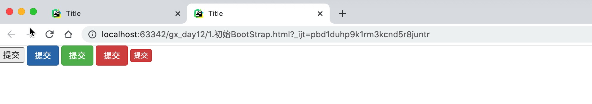
3.2 导航
<!DOCTYPE html>
<html lang="en">
<head>
    <meta charset="UTF-8">
    <title>Title</title>
    <link rel="stylesheet" href="static/plugins/bootstrap-3.4.1/css/bootstrap.css">
    <style>
        .navbar {
            border-radius: 0;
        }
    </style>
</head>
<body>

<div class="navbar navbar-default">
    <div class="container-fluid">
        <!-- Brand and toggle get grouped for better mobile display -->
        <div class="navbar-header">
            <button type="button" class="navbar-toggle collapsed" data-toggle="collapse"
                    data-target="#bs-example-navbar-collapse-1" aria-expanded="false">
                <span class="sr-only">Toggle navigation</span>
                <span class="icon-bar"></span>
                <span class="icon-bar"></span>
                <span class="icon-bar"></span>
            </button>
            <a class="navbar-brand" href="#">中国联通</a>
        </div>

        <!-- Collect the nav links, forms, and other content for toggling -->
        <div class="collapse navbar-collapse" id="bs-example-navbar-collapse-1">
            <ul class="nav navbar-nav">
                <li class="active"><a href="#">Link <span class="sr-only">(current)</span></a></li>
                <li><a href="#">广西</a></li>
                <li><a href="#">上海</a></li>
                <li><a href="#">神州</a></li>
                <li class="dropdown">
                    <a href="#" class="dropdown-toggle" data-toggle="dropdown" role="button" aria-haspopup="true"
                       aria-expanded="false">Dropdown <span class="caret"></span></a>
                    <ul class="dropdown-menu">
                        <li><a href="#">四川</a></li>
                        <li><a href="#">上海</a></li>
                        <li><a href="#">Something else here</a></li>
                        <li role="separator" class="divider"></li>
                        <li><a href="#">Separated link</a></li>
                        <li role="separator" class="divider"></li>
                        <li><a href="#">One more separated link</a></li>
                    </ul>
                </li>
            </ul>
            <form class="navbar-form navbar-left">
                <div class="form-group">
                    <input type="text" class="form-control" placeholder="Search">
                </div>
                <button type="submit" class="btn btn-default">Submit</button>
            </form>
            <ul class="nav navbar-nav navbar-right">
                <li><a href="#">登录</a></li>
                <li><a href="#">注册</a></li>
                <li class="dropdown">
                    <a href="#" class="dropdown-toggle" data-toggle="dropdown" role="button" aria-haspopup="true"
                       aria-expanded="false">Dropdown <span class="caret"></span></a>
                    <ul class="dropdown-menu">
                        <li><a href="#">Action</a></li>
                        <li><a href="#">Another action</a></li>
                        <li><a href="#">Something else here</a></li>
                        <li role="separator" class="divider"></li>
                        <li><a href="#">Separated link</a></li>
                    </ul>
                </li>
            </ul>
        </div><!-- /.navbar-collapse -->
    </div><!-- /.container-fluid -->
</div>


</body>
</html>
3.3 栅格系统
https://v3.bootcss.com/css/#grid
把整体划分为了12格
分类
响应式,根据屏幕宽度不同
.col-lg-   1170px
.col-md-   970px
.col-sm-   750px
非响应式
<div class="col-xs-6" style="background-color: red">1</div>
<div class="col-xs-6" style="background-color: green">2</div>
列偏移
<!DOCTYPE html>
<html lang="en">
<head>
    <meta charset="UTF-8">
    <title>Title</title>
    <link rel="stylesheet" href="static/plugins/bootstrap-3.4.1/css/bootstrap.css">
</head>
<body>
    <div>
        <div class="col-sm-offset-2 col-sm-6" style="background-color: green">2</div>
    </div>
</body>
</html>
3.4 container
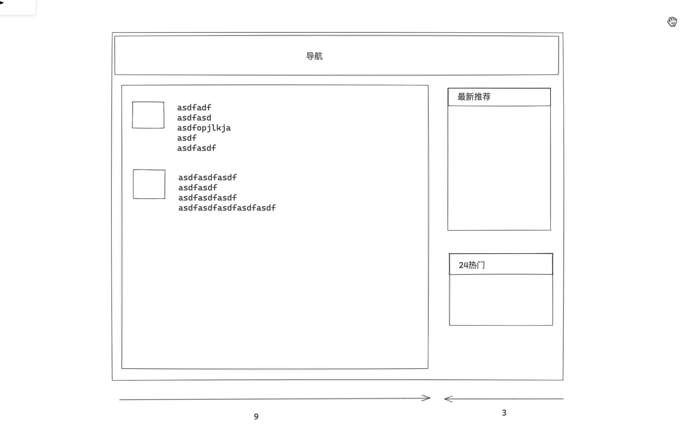
<div class="container-fluid">
    <div class="col-sm-9">左边</div>
    <div class="col-sm-3">右边</div>
</div><div class="container">
<div class="col-sm-9">左边</div>
<div class="col-sm-3">右边</div>
</div>3.5 面板
<div class="panel panel-default">
<div class="panel-heading">Panel heading without title</div>
<div class="panel-body">
Panel content
</div>
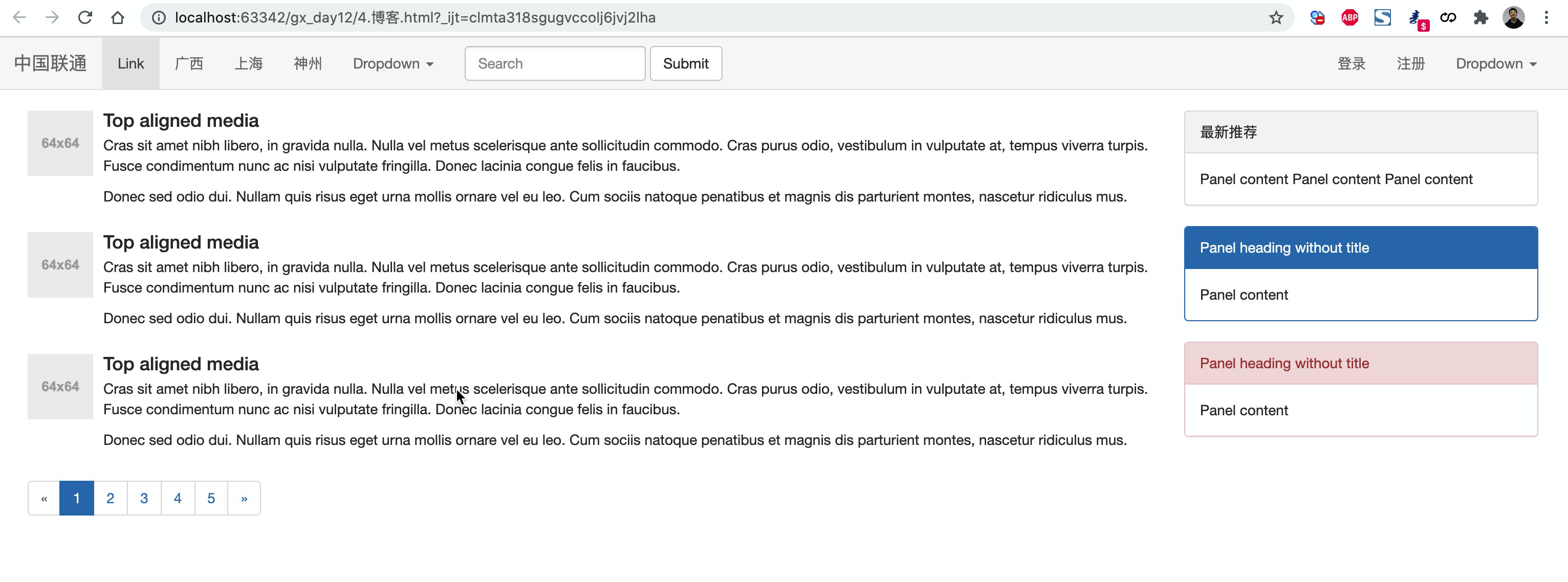
</div>案例:博客
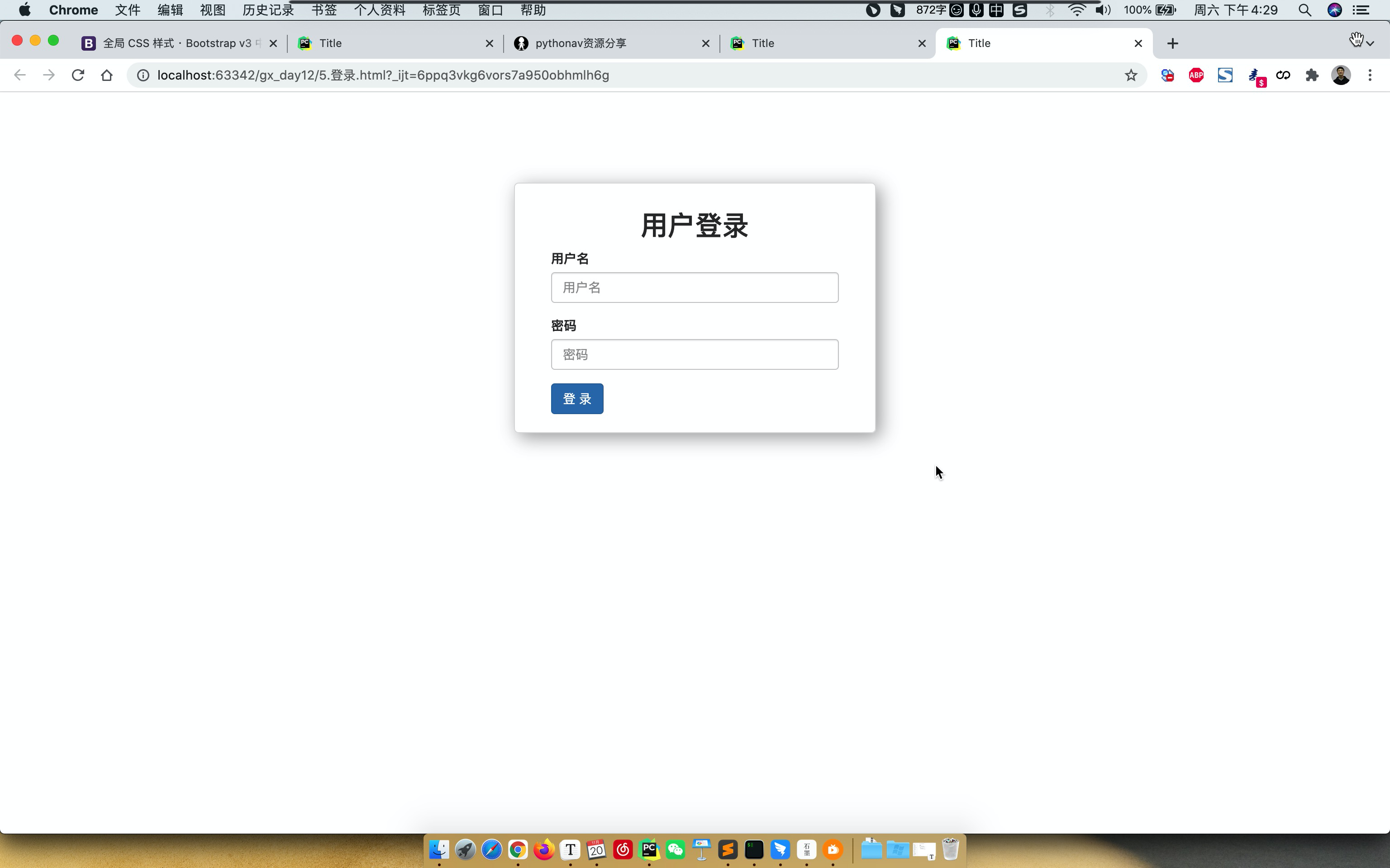
案例:登录
- 宽度 + 居中(区域居中)
- 内边距
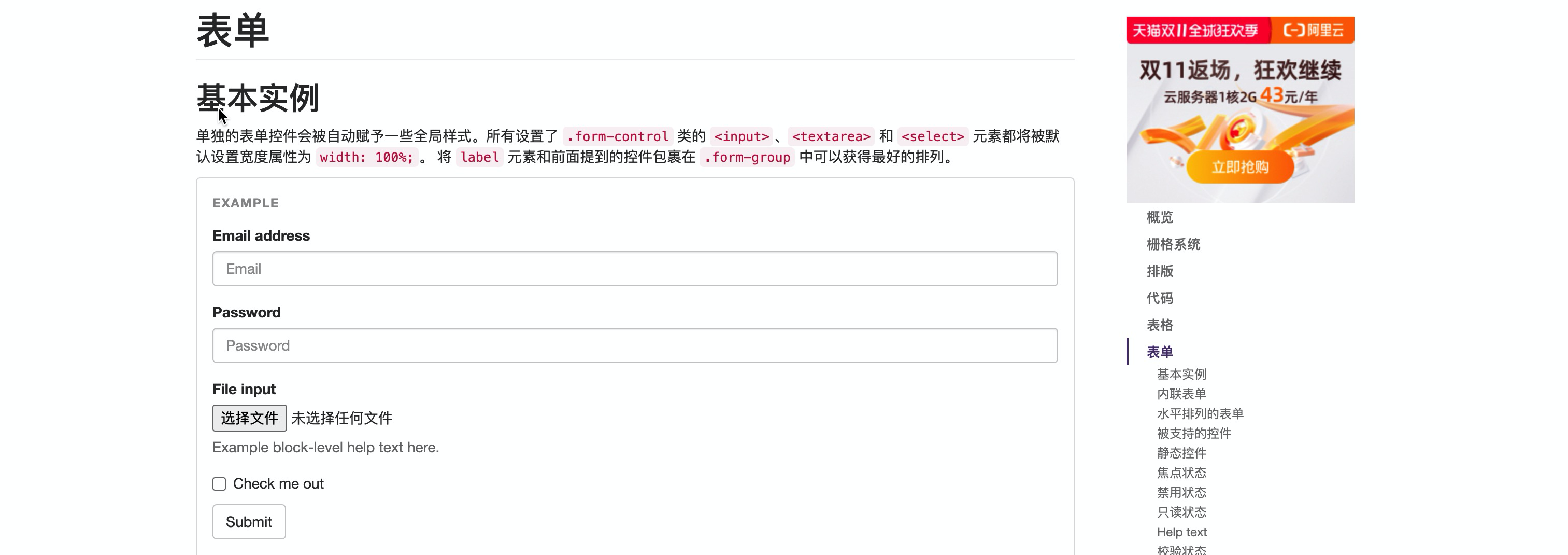
- 表单
<!DOCTYPE html>
<html lang="en">
<head>
<meta charset="UTF-8">
<title>Title</title>
<link rel="stylesheet" href="static/plugins/bootstrap-3.4.1/css/bootstrap.css">
<style>
.account {
width: 400px;
border: 1px solid #dddddd;
border-radius: 5px;
box-shadow: 5px 5px 20px #aaa;
margin-left: auto;
margin-right: auto;
margin-top: 100px;
padding: 20px 40px;
}
.account h2 {
margin-top: 10px;
text-align: center;
}
</style>
</head>
<body>
<div class="account">
<h2>用户登录</h2>
<form>
<div class="form-group">
<label for="exampleInputEmail1">用户名</label>
<input type="email" class="form-control" id="exampleInputEmail1" placeholder="用户名">
</div>
<div class="form-group">
<label for="exampleInputPassword1">密码</label>
<input type="password" class="form-control" id="exampleInputPassword1" placeholder="密码">
</div>
<input type="submit" value="登 录" class="btn btn-primary">
</form>
</div>
</body>
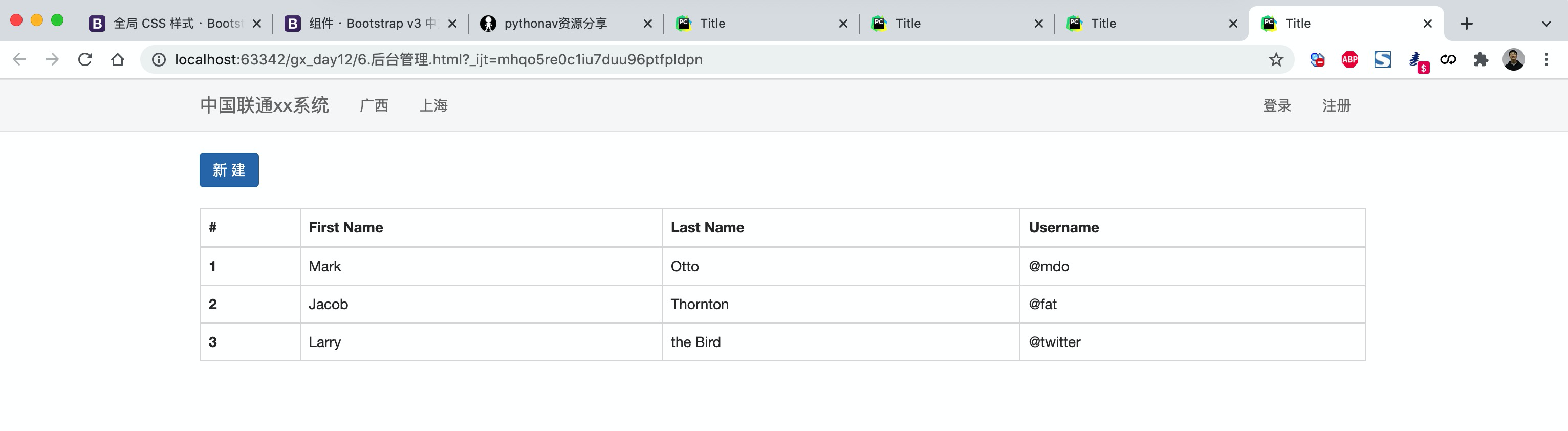
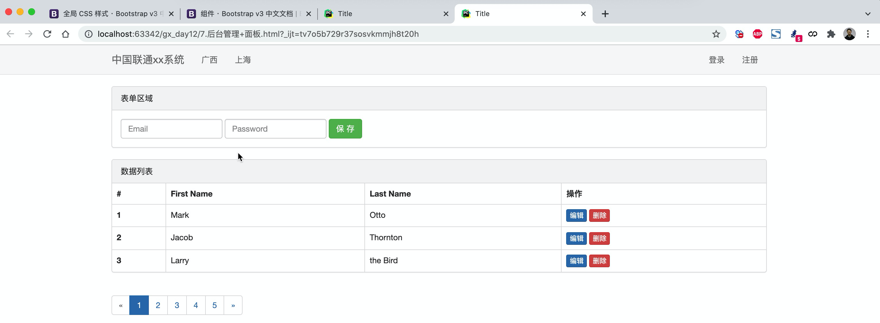
</html>案例:后台管理
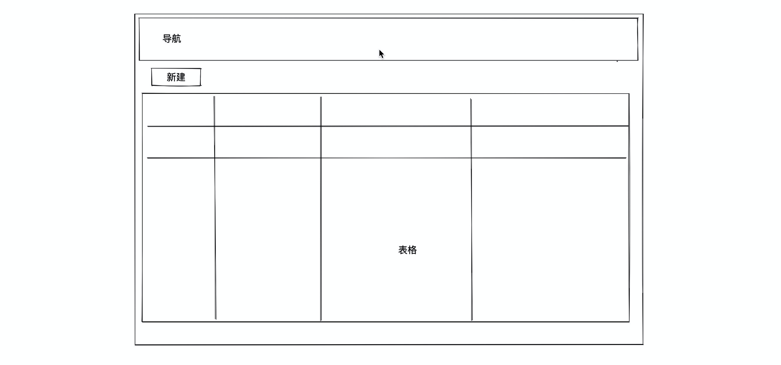
- 导航
- 新建,按钮。
- 表格,
<!DOCTYPE html>
<html lang="en">
<head>
    <meta charset="UTF-8">
    <title>Title</title>
    <link rel="stylesheet" href="static/plugins/bootstrap-3.4.1/css/bootstrap.css">
    <style>
        .navbar {
            border-radius: 0;
        }
    </style>
</head>
<body>
<div class="navbar navbar-default">
    <div class="container">

        <div class="navbar-header">
            <button type="button" class="navbar-toggle collapsed" data-toggle="collapse"
                    data-target="#bs-example-navbar-collapse-1" aria-expanded="false">
                <span class="sr-only">Toggle navigation</span>
                <span class="icon-bar"></span>
                <span class="icon-bar"></span>
                <span class="icon-bar"></span>
            </button>

            <a class="navbar-brand" href="#">中国联通xx系统</a>
        </div>

        <div class="collapse navbar-collapse" id="bs-example-navbar-collapse-1">
            <ul class="nav navbar-nav">
                <li><a href="#">广西</a></li>
                <li><a href="#">上海</a></li>
            </ul>
            <ul class="nav navbar-nav navbar-right">
                <li><a href="#">登录</a></li>
                <li><a href="#">注册</a></li>
            </ul>
        </div>

    </div>
</div>

<div class="container">
    <div>
        <input type="button" value="新 建" class="btn btn-primary"/>
    </div>

    <div style="margin-top: 20px">
        <table class="table table-bordered table-hover">
            <thead>
            <tr>
                <th>#</th>
                <th>First Name</th>
                <th>Last Name</th>
                <th>Username</th>
            </tr>
            </thead>
            <tbody>
            <tr>
                <th scope="row">1</th>
                <td>Mark</td>
                <td>Otto</td>
                <td>@mdo</td>
            </tr>
            <tr>
                <th scope="row">2</th>
                <td>Jacob</td>
                <td>Thornton</td>
                <td>@fat</td>
            </tr>
            <tr>
                <th scope="row">3</th>
                <td>Larry</td>
                <td>the Bird</td>
                <td>@twitter</td>
            </tr>
            </tbody>
        </table>
    </div>

</div>


</body>
</html>
案例:后台管理+面板
<!DOCTYPE html>
<html lang="en">
<head>
    <meta charset="UTF-8">
    <title>Title</title>
    <link rel="stylesheet" href="static/plugins/bootstrap-3.4.1/css/bootstrap.css">
    <style>
        .navbar {
            border-radius: 0;
        }
    </style>
</head>
<body>
<div class="navbar navbar-default">
    <div class="container">

        <div class="navbar-header">
            <button type="button" class="navbar-toggle collapsed" data-toggle="collapse"
                    data-target="#bs-example-navbar-collapse-1" aria-expanded="false">
                <span class="sr-only">Toggle navigation</span>
                <span class="icon-bar"></span>
                <span class="icon-bar"></span>
                <span class="icon-bar"></span>
            </button>

            <a class="navbar-brand" href="#">中国联通xx系统</a>
        </div>

        <div class="collapse navbar-collapse" id="bs-example-navbar-collapse-1">
            <ul class="nav navbar-nav">
                <li><a href="#">广西</a></li>
                <li><a href="#">上海</a></li>
            </ul>
            <ul class="nav navbar-nav navbar-right">
                <li><a href="#">登录</a></li>
                <li><a href="#">注册</a></li>
            </ul>
        </div>

    </div>
</div>

<div class="container">
    <div class="panel panel-default">
        <div class="panel-heading">表单区域</div>
        <div class="panel-body">
            <form class="form-inline">
                <div class="form-group">
                    <label class="sr-only" for="exampleInputEmail3">Email address</label>
                    <input type="email" class="form-control" id="exampleInputEmail3" placeholder="Email">
                </div>
                <div class="form-group">
                    <label class="sr-only" for="exampleInputPassword3">Password</label>
                    <input type="password" class="form-control" id="exampleInputPassword3" placeholder="Password">
                </div>
                <button type="submit" class="btn btn-success">保 存</button>
            </form>
        </div>
    </div>

    <div class="panel panel-default">
        <div class="panel-heading">数据列表</div>
        <!--
        <div class="panel-body">
            注意:以下我们经过筛选出来的重要数据。
        </div>
        -->

        <table class="table table-bordered table-hover">
            <thead>
            <tr>
                <th>#</th>
                <th>First Name</th>
                <th>Last Name</th>
                <th>操作</th>
            </tr>
            </thead>
            <tbody>
            <tr>
                <th scope="row">1</th>
                <td>Mark</td>
                <td>Otto</td>
                <td>
                    <a class="btn btn-primary btn-xs">编辑</a>
                    <a class="btn btn-danger btn-xs">删除</a>
                </td>
            </tr>
            <tr>
                <th scope="row">2</th>
                <td>Jacob</td>
                <td>Thornton</td>
                <td>
                    <a class="btn btn-primary btn-xs">编辑</a>
                    <a class="btn btn-danger btn-xs">删除</a>
                </td>
            </tr>
            <tr>
                <th scope="row">3</th>
                <td>Larry</td>
                <td>the Bird</td>
                <td>
                    <a class="btn btn-primary btn-xs">编辑</a>
                    <a class="btn btn-danger btn-xs">删除</a>
                </td>
            </tr>
            </tbody>
        </table>

    </div>
    <ul class="pagination">
        <li class="disabled"><a href="#" aria-label="Previous"><span aria-hidden="true">«</span></a></li>
        <li class="active"><a href="#">1 <span class="sr-only">(current)</span></a></li>
        <li><a href="#">2</a></li>
        <li><a href="#">3</a></li>
        <li><a href="#">4</a></li>
        <li><a href="#">5</a></li>
        <li><a href="#" aria-label="Next"><span aria-hidden="true">»</span></a></li>
    </ul>

</div>


</body>
</html>
3.6 图标
bootstrap提供,不多。
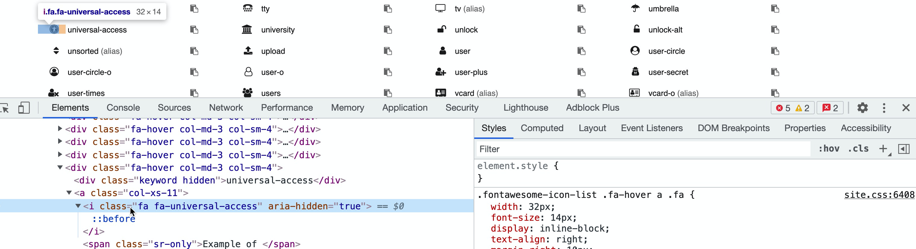
fontawesome组件
https://fontawesome.dashgame.com/下载
引入
<link rel="stylesheet" href="static/plugins/font-awesome-4.7.0/css/font-awesome.css">使用
示例见:
- 博客
- 后台管理 + 面板
3.7 BootStrap依赖
BootStrap依赖JavaScript的类库,jQuery。
- 下载 jQuery,在页面上应用上jQuery。
- 在页面上应用BootStrap的JavaScript类库。
4.提前聊JavaScript
- HTML,裸体
- CSS,好看
- JavaScript,动态。
- 编程语言
- 类库(模块)【jQuery是javaScript的类库】